Wednesday, April 19, 2017

David Lynch: The Art Life


"In those days, my world was no bigger than a couple of blocks. Huge worlds are in those two blocks."

I'll begin this review with a warning: this documentary isn't for everyone. In fact, unless you're a die-hard Lynch fan, an art fan, or an art student, I would easily assume you'd be susceptible to a few yawns here and there. 

Now with that being said, I spent the entire hour and thirty minutes grinning. David Lynch truly is a legend. The man that brought you such cult classics like Twin Peaks, Mulholland Drive, Blue Velvet, and Eraserhead, to name a few, finally gives you a peak into his upbringing and his life as an artist, which to the general public is something of an unknown. The Art Life is a documentary about Lynch's early life, from his youth in Spokane, Washington (hello, Twin Peaks inspiration), to the move to Montana and Idaho, and finally Philadelphia, where he pursued his career in art.  

The wonderful thing about Art Life is that it's told strictly through Lynch's narration in his home, with shots of him present day, bouncing his daughter on his lap, serenely painting. This is intermitted with photos of his earlier artwork, along with videos and images of his family and friends growing up. Being so simplistic seems to work; you're absolutely enamoured by Lynch's way of telling a tale. I couldn't take my eyes off the screen, constantly watching these old clips of him just waiting for a glimpse of something unexpected or shocking. That being said Lynch is a tease, and as we all know loves to leave you guessing.
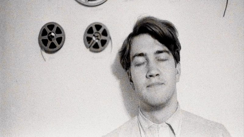


The contrast between his upbringing and his art is something peculiar as well. He describes his mom in the most wonderful way, being a loving mother but still stern and religious, albeit not in a suffocating manner. His father on the other hand was exceptionally fair, and would always meet David "halfway" when he had a favour to ask. These stories are coupled with images of his artwork, that to someone watching the film on mute would be absolutely disturbed by what must have been going on in his head. 

Stories of David falling in with the wrong crowd in his teens and a bizarre occurrence as a child playing in his neighbourhood and coming across a bloodied, naked woman walking past seem to shape thoughts and ideas in his films later on. Blue Velvet and Twin Peaks suddenly seem to have a little bit of truth littered about, and running into things like that are what make this film such a treat to watch.

Even with some bizarre occurrences in his formative years, and with his artwork that teeters on the dark side, I spent my time in the theatre oddly enough feeling like I understood him, and watching as he seemed absolutely at ease and laid-back, with not a care in the world. It's equally as fascinating finding out about his passion for art and the constant praise from artist Bushnell Keeler who pushed him to continue painting.


"You drink coffee, you smoke cigarettes, you paint, and that's it."

The film neatly ties together in the end, where Lynch sees one of his pictures moving, thus inspiring him to make "moving pictures", this then turns into his departure to LA, and subsequently ends with the creation of Eraserhead.

Jon Nguyen, who directed the documentary really succeeds in giving it a Lynchian vibe, which I'm sure David helped with, leaving you wanting to know so much more, but still content hearing about the director's intimate beginnings.


//


SHARE:

Thursday, October 13, 2016

The Shining: Eradicating the American Dream


It's October! My favourite month. Partly because of my birthday, partly because of Halloween. As you most of you already know, I'm a huge horror movie fanatic. Like, absolutely, totally, entirely. 

Anyway, I was talking to the bestie the other day (speaking of which, she's an artistic maven and everyone should look at her instagram)  and trying to brainstorm some stuff to do for the month of October and she got super excited and suggested I dedicate a month to horror on the blog! It made perfect sense. Soooo anyway I figured, why not ramble on about some horror classics, some contemporary gems, and maybe even throw in a Halloweeny-inspired fashion post here and there too? Sounds like a dream.

Cue The Shining! This was such a good excuse to watch one of my all-time favourite horror classics. Kubrick is a God and does wonders. From creating a sense of isolation in a massive hotel, to his fluid use of a Steadicam, this movie is a complete masterpiece. The music is painstakingly scored to be absolutely menacing, and the set work is beautiful and beyond unsettling.

Moving along, as I'm sure most people know, the movie centers around a writer (Jack Nicholson) and his lil' family who all agree to watch over a hotel in its winter down season while it is empty. The catch? The hotel is probably (definitely) haunted and the last groundskeeper went nutso and axed his whole family. LOVELY. 


Obviously, Jack goes mental, giving way to historic one-liners, but there's so much more to this film. Nothing Kubrick does is by chance, and there are so many theories out there for what it's truly about. Some say it's a metaphor for Danny (the son) being abused by Jack. Others say it's a metaphor for the American treatment of Indians. With so many different theories and contradictions, it's really up to the viewer to interpret it how they will, and honestly, after seeing this movie countless times, there's always a different thing I pick up on as well.

After watching it this time..I thought I noticed something clever, and it really stuck with me. It was a sort of downfall of Americana,and the perfect American dream. So many things about this are anti "white picket fence." From things like Danny's Apollo pullover (after it gets shredded, suggesting a symbol of a torn-apart American icon), to the obvious breakdown of Jack shouting the classic, "Honey, I'm home"-esque line, "here's Johnny!", this movie is riddled with little clues. 


The colour palette throughout the entire movie is the good ol' American red, white, and blue. The frustration with the american dream and family runs so deep, it's nuts. Right off the bat, you can tell Jack isn't happy with his family. Doesn't get on with his wife too much, takes a sneaky peek at the rumps of two lovely ladies as he enters the hotel. Driving to the hotel you notice he's short with his boy. Irked by his questioning, he only lights up when Danny tells him he's learned about cannibalism on TV. TV after all, is the driving force of a structured family life. With his "here's Johhny" breakdown near the end, it's essentially a quote from popular TV culture, and in a way, the breakdown of the nuclear family. 

Jack's run-ins with the ghosts as well are jabs at American culture. Dealing with racism and class, all these elements are quintessentially a part of American history and the slow deterioration of society. When he's talking to the old caretaker of the hotel, and he brings up Jack's son intermingling with a coloured man, this whole scene takes place in a red and white bathroom, with Jack standing in the middle, in his working class blue jeans. Coincidence? 


Even more so, when we see the Grady girls murdered in the hall, it's interesting to see that they're both dressed in blue, doused in blood (red), with the blue and white walls surrounding them. Kubrick, you're a legend.

With all these sprinkled little clues, the most obvious one, is the fact that Jack in fact out to kill his family, just how the groundskeeper did before him. If that's not an attack on the quintessential nuclear family, I don't know what is. 

The Shining is unforgettable. It's beautiful, it's terrifying, and it's spun to such perfection, it shows that horror films don't have to rely on cheap scares to leave its audience transfixed. It's a timeless film, and truly shows Kubrick at his absolute best.
SHARE:

Wednesday, February 18, 2015

Pierrot le Fou - Costume Review


Hello hello!

I thought it would be fun to do a review on one of my all-time favourite movies, one that's a classic yet filled with so many gorgeous fashion gems. Jean-Luc Godard's Pierrot le Fou is a 60s delight and is such a piece of cinematic artistry from so many different perspectives, be it from cinematography to dialogue.

The movie centers around Ferdinand (also called Pierrot), who becomes bored of his routine, high-society life. He decides to run away with a former love interest Marianne, who he finds out is entangled with mobsters from Algeria. The two run away together, searching for adventure as Pierrot finally discovers how to feel alive.

Watching this movie, you slowly realize that the plot is irrelevant; you watch it more for the gorgeous experimental approach to cinema and the way Godard uses a primary colour palette in the character's costumes to convey their emotional states and the differences between men and women (I promise I'll get a bit more into that later.)

 Anna Karina is absolutely adorable and basically my style icon.

First off, let's take a peek at Marianne. The free spirited protagonist has a really feminine and pastel colour palette the first time we see her. A baby blue robe she wears at home and then a pale pink dress with a pale blue cardigan. These pieces attract an almost childlike innocence to her and could explain why Pierrot decides to run away with her. The pale pink dress has a frilly trim at the top and bottom and suggests a delicate quality about her, which she later on sheds for a different persona.

As the movie goes on, Marianne starts opting for more fiery red tones, slowly getting rid of her delicate persona for a more adventurous one. She wears a red and white striped dress with a white bow in her hair at one point, the feisty red peeking through the white innocent details.

One of the final outfit changes consists of a red dress with a u-neck collar and small white trim on the sleeves. This is Marianne at her most passionate and feminine. She even says she doesn't care about money or buying records or clothes, all she wants to do is live and this piece proves it.


Pierrot on the other hand goes through a completely different experience through his clothing choices. His palette becomes less boring and free spirited, as well as  gaining some delicate hues which show emotion. Starting off with a tweed grey suite, Pierrot is living a dull life and you can definitely tell. Although always fashionable, he isn't exploring colour just yet.


Upon running away and breaking out of his shell, Pierrot has on a colourful striped button up with shades of red, blue, purple, green, and yellow. He's loosing up and his emotions are running wild after being confined for so long. He moves on to a pale blue suite after a while, subsiding his emotions and becoming content with what his life is becoming. Near the end (and I promise I won't ruin it), he finishes the movie with a bang and wears a bright red shirt; Godard's way of telling us the passionate state he's in.

Still a babe even with blue face paint.

As for Godard's use of primary colours in the movie? It's definitely visually pleasing to see so many variations of red and blue contrasting, but there must be more to it! If you think about it (and this is just my interpretation, mind you), The red and blue represent opposites in the movie. Red is there for the emotion and and desire in the film, all of the fiery emotions a human can feel. Red in this case can also display femininity, like in Marianne for example. Blue on the other hand can convey masculinity, order, peace, and structure. These two colours are in constant contrast with one another, and it's no wonder this is why our two leads are stuck in a constant struggle to communicate properly.

Welcome to life between men and women.

All in all words cannot express how much I recommend this movie. It was so much fun to review as Godard really is a genius, and nothing is left to chance when it comes to his directorial style. If you guys want a peek at some modern day inspiration that came from this movie, take a peek at what I assembled below!

xx

M

Anna Karina - Pierrot le Fou


SHARE:

Tuesday, February 3, 2015

Moonrise Kingdom - Costume Review


So this week I was once again tasked with the job of deciding what movie to pick for my weekly costume review. All the Oscar nominated movies with worthwhile costumes are still in theatres, and I've recently been boycotting going to the movies for personal reasons (someone actually took their baby with them to see The Hobbit a few weeks ago, all I'll say is it didn't turn out well for anybody).  Anyways, this left me in a bit of a pickle so I decided to stick to my recent Wes Anderson binge and re-watch the 2012 gem, Moonrise Kingdom.

It's so cute and so fun and anybody who knows me knows I'm a sucker for anything 60s related, which is the time period where the movie is set. The story follows a pair of young and infatuated lovers who decide to run away together from their small New England island, which causes a frantic search party to chase after them.


Sam Shakusky, our lead character, is a Khaki Scout, so his main piece is the traditional boyscout uniform. He wears his badges proudly, along with his Coonskin cap, which is completely true to the time period. Boys during the 50s and 60s emulated Davy Crockett with these hats, it being a huge trend of the time. Sam's a bit of a know-it-all as well, and you can totally tell from the way he's dressed. Unlike Some of the other scouts, his uniform is always put together to perfection, with his socks always pulled up high. He carries a backpack with all the things a well-rounded Khaki Scout should have, and his camp leader even mentions at one point that whoever is to run away with him is in good hands.

Isn't this simply the cutest dress ever? I've been on the lookout for something even remotely as charming.

Suzy Bishop, the other half of this duo, I would say is completely inspired by her French icons of the time. She says at one point that her favourite record is one by Francoise Hardy and you can definitely tell she borrows elements from her overseas idols. Dainty Peter Pan collars, mini dresses, knee-high socks, and berets all add to the Parisian charm of the 60s. Suzy also keeps her clothing palette to girly pastels, which serve as as dead give-away to her sensitive nature. She acts really tough but deep down has a romantic soul that ultimately did run away to be with her love interest.


 As for the other characters, like the Khaki Scouts for example, paying close attention to their uniforms gives a glimpse to their personalities as well. The badges that each scout wears vary, the one's closer to their shoulders signify what they specialize in and fit with their personalities. For example, one kid has a badge with the words "Judo Expert" on it. His uniform is slightly darker than the rest and he just generally has a bit more of a reckless personality, rides a motorcycle, and asks if he can use "force" to bring back Sam to the campsite.

Imagine how long it must have taken for all those badges to be sewn on!

There are so many intricate details to this movie that the best thing I can say is to see for yourself if you already haven't.

Re-watching Wes Anderson's films I can only compare to that of reconnecting with an old flame that you'll always have a soft spot for. You just so happen to run into his movies, decide to spend all of your waking hours watching them engulfed in a whirlwind of emotions, only to stop and go your separate ways with fond memories of your adventures together.

--------

Want to try something similar to what Suzy has on? Take a peek.

Moonrise Kingdom Outfit Inspiration


SHARE:

Friday, January 23, 2015

The Owls Are Not What They Seem - A David Lynch Inspired Shoot

I thought I'd share with you guys a little photoshoot I did for my class a while back that was inspired by one of my favourite directors: David Lynch.


I named the shoot Neon Dreams, which was inspired by the director famous for his surrealist approach to cinema. With movies such as Blue Velvet, Mulholland Drive, and his hit show Twin Peaks, Lynch has always been able to transport his viewers into a dream-like world filled with bizarre lighting and extensive imagery.

My interpretation of Lynch takes the form of a stunning floor length black velvet dress, in combination with the abstract lighting and distorted reflections. The goal is to transport the viewer into one of his transcendental stories.

The hair and make up application I was going for was big and glamorous, with big teased hair and long winged eyeliner. A good source of inspiration for this application came from Lana Del Rey (whom I absolutely adore!)

Lana Del Rey is perfect. She actually is.


I had a ton of fun with this shoot, it's so awesome when you get a chance to incorporate people you're inspired by into your work. Hope you all enjoy what I came up with!

xx

M


Photography - Matthew Burditt
Hair/Makeup - Terra French
Model - Nicole Gibson @ Charles Stuart


SHARE:

Wednesday, January 21, 2015

Finally Back from Vacation // A Review on the Netflix hit: Mr. Selfridge

Hello hello!

Back to the grind finally after being away and relaxing for a good two months! Vacation was swell, it was nice to see family and friends in Belgrade, and Amsterdam was phenomenal, to say the least. Everything was absolutely stunning and I've never fallen more in love with a city in my life! I'll make sure to add photos soon enough, as everything looks like it came out of a fairy tale. 

Now, for the movie business. I've been sitting and racking my brain trying to decide what movie or show I should do my next costume review on, and then came across a gem of a TV show on Netflix: Mr. Selfridge.

Three words to describe this show? Oh.My.God.

Those hats, those fabrics, those chocolates!

I don't want to give too much away, but the show (which is based on the book Shopping, Seduction, and Mr. Selfridge) essentially revolves around the creation of the first ever department store, Selfridge and Co. The owner of the store (Mr. Selfridge himself), is an American that has come to London in the 1910s, in hopes of creating a new shopping experience for the world.

It's really interesting to see how the theory behind a department store comes together, I can't even imagine how dull shopping must have been like prior to Selfridges. It just seems absolutely bizarre to only buy items out of utility purposes and not guilty personal pleasure.

Look how excited everyone is to shop. This would be me, basically.

As a viewer you also get to witness the first ever idea of a massive store-wide sale that every shopper now holds dearly in their hearts, as well as the first ever creative window displays, which are a gem to see.

And the costumes? A delight. The show's costume designer, James Keast really captured Edwardian fashions of the time, especially for the females. The show is filled with fancy millinery, choker necklaces, and over-the-top dresses. The cool thing is is that as time progresses in the second season, as do the fashion trends! The colour palettes of the characters are suddenly brighter, furs are being worn more and more (probably due to colonial ties between Britain and Canada at the time), and conversations about big-name designers of that era are being had such as Paul Poiret, for example.


I totally sound like a complete geek but this show genuinely excites me so much. We take all these elements of modern day shopping for granted, and it's so cool to finally see how they came to be. Throw in a little bit of sex and scandal into the mix and this show will have you hooked. Even my boyfriend, who could care less about becoming educated on fashion adored the show and couldn't stop watching.

The 3rd season starts in March, so I highly recommend all of you get hooked on it immediately and then share your thoughts with me :)

Happy binging everyone!

xoxo


SHARE:

Saturday, November 8, 2014

Costuming in Film: Funny Face - The Evolution of Audrey Hepburn's Look

Hello hello,

Before I get into the costume review I must mention my going away for a little 3 week vacation to Europe now that I’m done school! The itinerary will consist of Amsterdam and Serbia (random, I know) for some sightseeing and visiting family and friends. I’m extremely excited as I haven’t been travelling since I started school and it’ll be nice to get away and decompress.

Will I be updating the blog you ask? Most definitely. I thought it would be fun to include some photos of my travels as well, so I'm really looking forward to making some worthwhile memories in the next coming weeks!

Now for the review…


I thought it would be fun to do a throwback costume review and mix things up a little bit, and what better movie to do it with than 1957’s Funny Face? For those of you who haven’t seen it, it is a fashionista’s dream. I'm not even a huge fan of musicals at all and this movie holds a dear place in my heart. The film revolves around a doe-eyed and young Audrey Hepburn, who works at a book store, only to be scouted as the new face of a fashion magazine. Along the way she falls for the Dick Avery, (the photographer who scouted her) played by Fred Astaire. She also grows to be liked by the magazine’s editor, played by the hilarious Kay Thompson. A fun fact about the movie is that Thompson's character is said to be modelled after Diana Vreeland, the late editor of Vogue.

The film's legendary costume designer, Edith Head was one of the best in the business, working with all of the top Hollywood starlets at the time. She also boasts an impressive 8 Academy Awards as a costume designer, which is to this day more than any other person. However, Edith can't take all the credit for the movie's extravagant garments. Givenchy designed all of Hepburn's Paris wardrobe, as stated in the film's opening credits. The gowns are absolutely spectacular, and I'll get to them later as there are a total of 9 I believe (!)


I thought we could get started with the adorable Jo, played by Audrey. When we first see her she is portrayed as the polar opposite of a fashion icon (I still found her cute, but that’s beside the point). She’s wearing frumpy clothes that are extremely shapeless, telling the viewer that all Dick Avery had to go by when scouting her was her “funny face”. This also speaks to her character, who doesn't believe in fashion magazines and “silly women” as she calls them. She’s wearing shapeless clothes to rebel and show her discontent to anything fashion-related.


As she later on gets hauled to Paris for numerous photoshoots, we see her slowly changing her style. She escapes her frumpy wardrobe and while not being photographed she wears all black. She's still an individual that won't succumb to trends, wearing all black keeps her neutral and unaffected by fashion. She also spends a lot of time in underground Parisian cafes and bars, home to intellectual and artsy beatniks at the time. Her all-black style is pretty beatnik in itself, with the black cigarette pants and black turtle neck.

Her gorgeous pieces she wears while she's being photographed I don't believe really speak to her character, as she's posing in them for a magazine, but it would be treason not to include them, so...


Lovely, aren't they?

Next on our list is Maggie Prescott, editor of Quality magazine. She is the polar opposite of Jo, completely enthralled in a fashionable lifestyle. Dressed to the nines in a plethora of one of her dazzling ensembles, Maggie always looks in charge. An interesting observation about Maggie’s costumes is that her neck is almost always covered by what she’s wearing, speaking maybe to her character and how uptight she is.


Dick Avery, Jo’s love interest and photographer, isn’t as uptight as Maggie although he works in the same industry. His colour palette includes soft colours; pastel blues, pinks, and yellows. He’s got a kind heart and delicate colour palette to go with it.


Dick’s shirts usually aren't buttoned all the way and his ties are undone, which speaks to his laid back personality, unlike Maggie’s. He usually rolls up his sleeves while he’s working, or casually drapes a sweater on his back. In the fishing scene, he sports a pair of white sneakers, speaking to his character yet again.


I thoroughly encourage whoever hasn't seen this classic to do so, as it’s a must for anyone interested in fashion. It really was a delight to watch it again, proving that this film goes against the test of time. 


I hope everyone is having a lovely start to their Saturdays, and has a wonderful weekend ahead of them.

xx

Marta
SHARE:
© Paradise Playground. All rights reserved.
BLOGGER TEMPLATE DESIGNED BY pipdig